Year
Client
Industry
Service
FOX is a large-scale e-commerce platform redesign created to improve product discovery, simplify navigation, and optimize the purchasing experience across desktop and mobile devices. The project included a complete UX rethink of the customer journey — from authorization and catalog browsing to checkout and account management.
The redesign process started with a deep analysis of the existing online store experience. After identifying usability bottlenecks and conversion barriers, user behavior patterns and customer preferences were mapped into detailed user scenarios and interaction flows. Based on this research, a completely updated sitemap and platform architecture were developed.
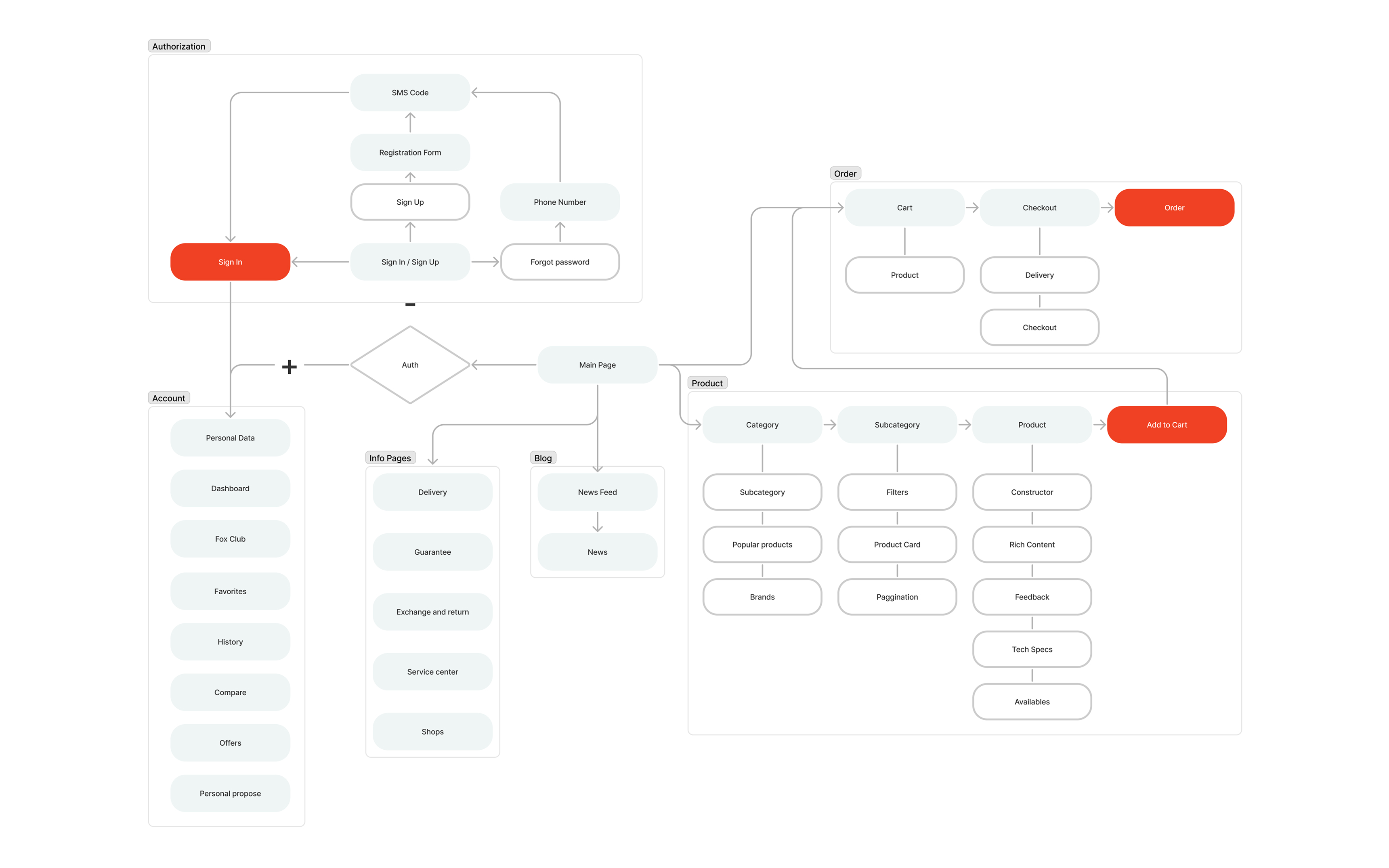
The structure of the platform was designed around a scalable and modular system. A 24-column grid with a 1228px breakpoint was used for desktop layouts, while adaptive 8- and 4-column systems ensured flexibility and consistency across tablets and mobile devices. This approach made it possible to maintain visual balance while supporting a content-heavy interface with large product catalogs and multiple user interaction points.
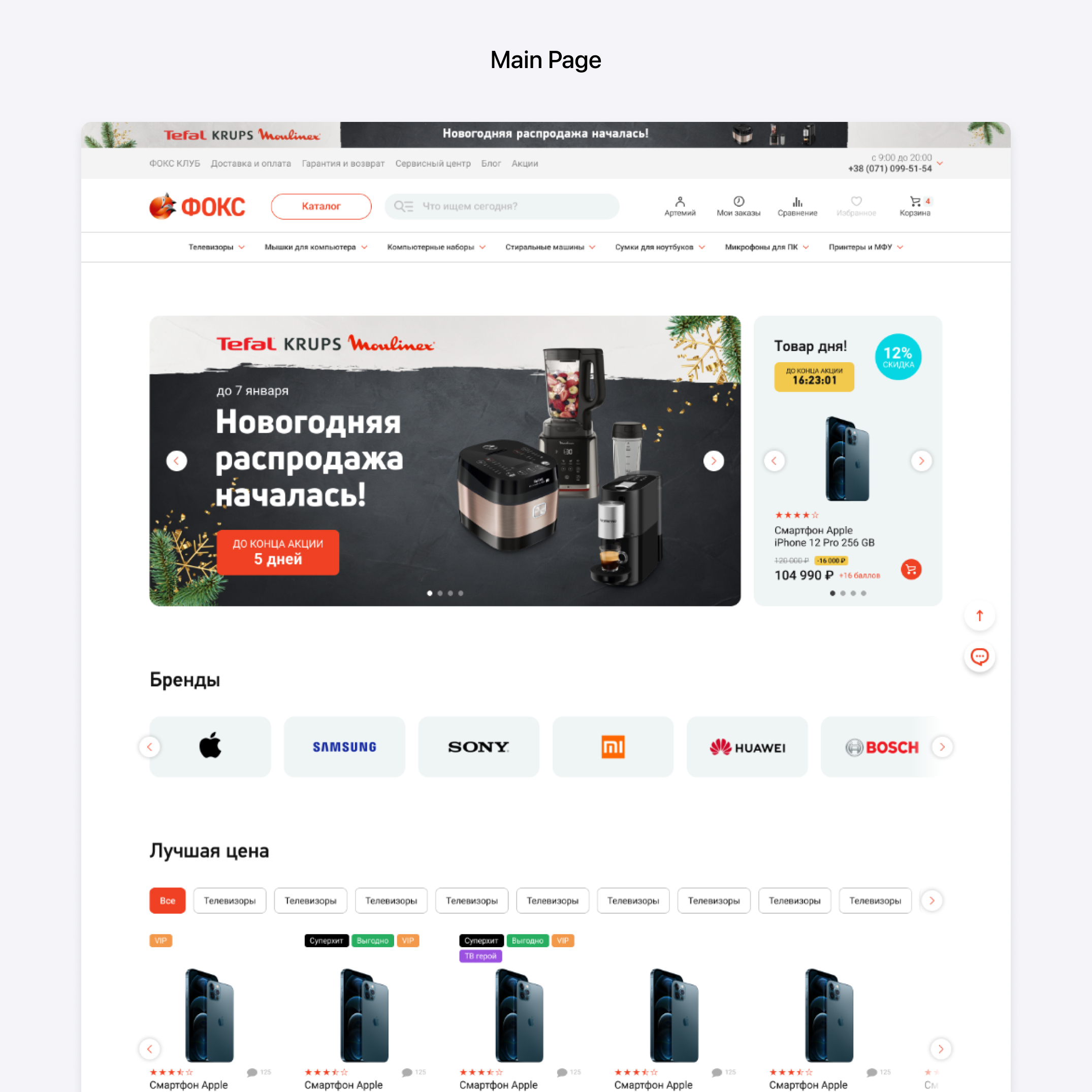
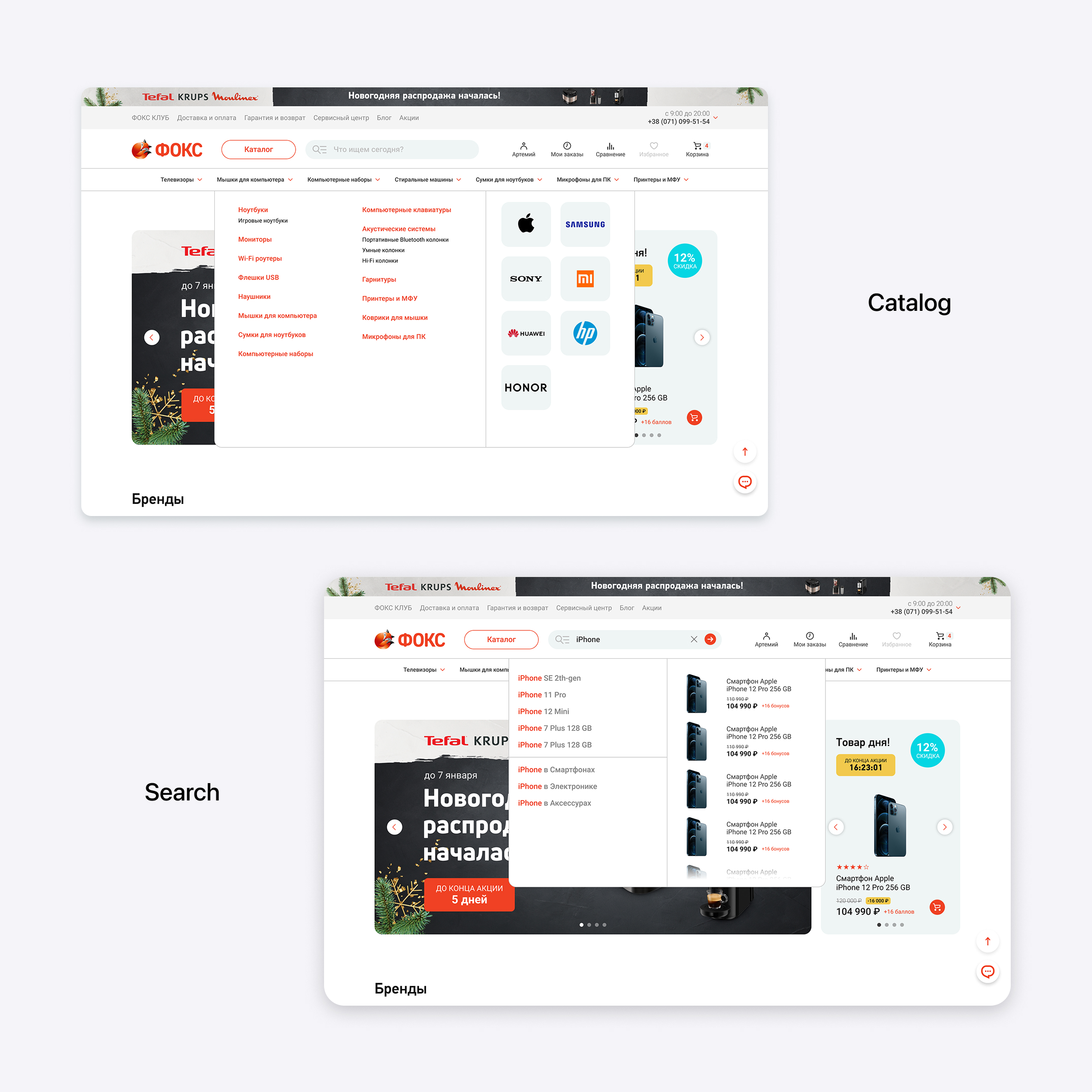
A major focus of the project was navigation. The header was redesigned into a multifunctional control center that combines catalog access, product search, quick navigation, and personal account interactions. Special attention was given to the catalog and search experience, including expanded category navigation, smart search suggestions, filtering systems, and improved product discovery mechanics.
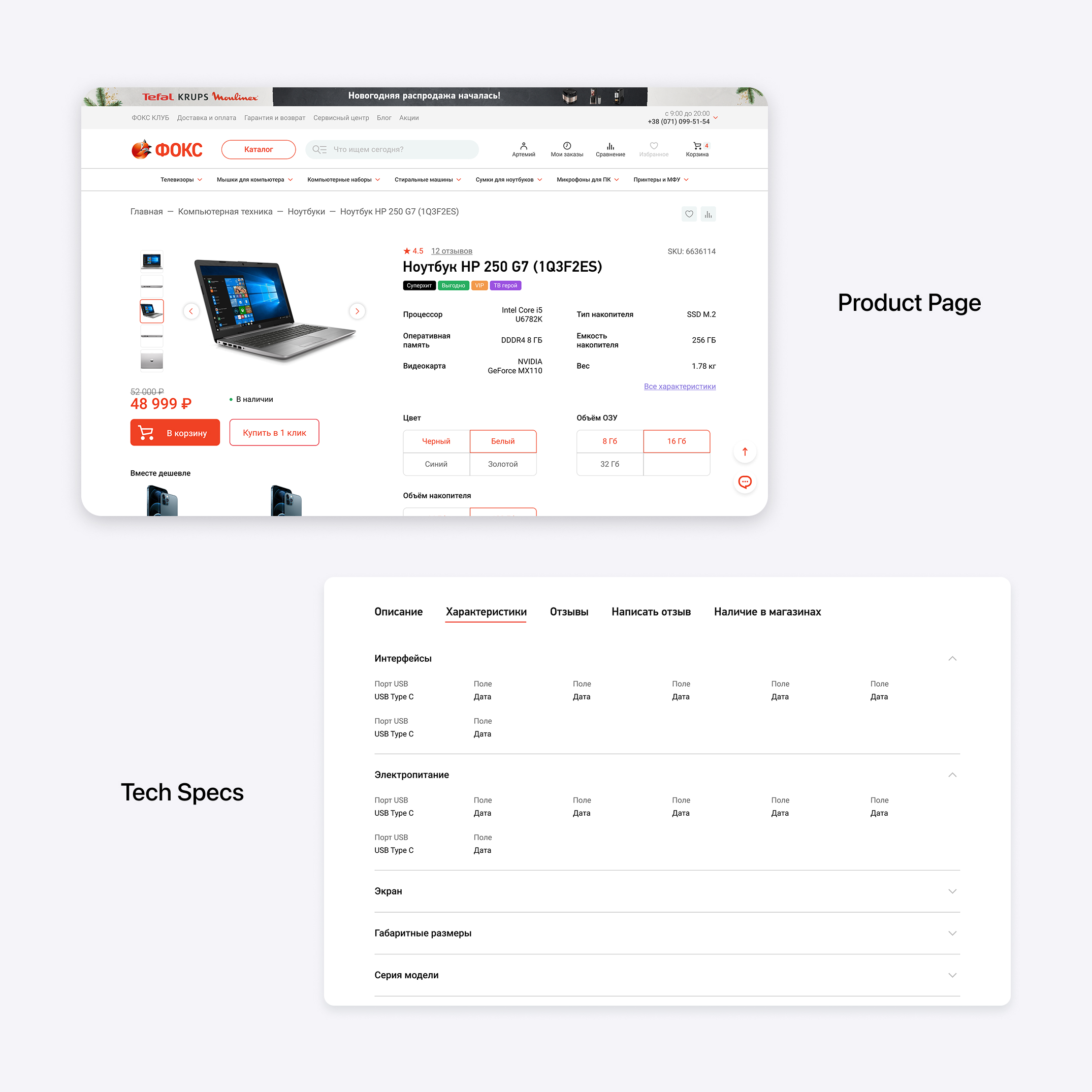
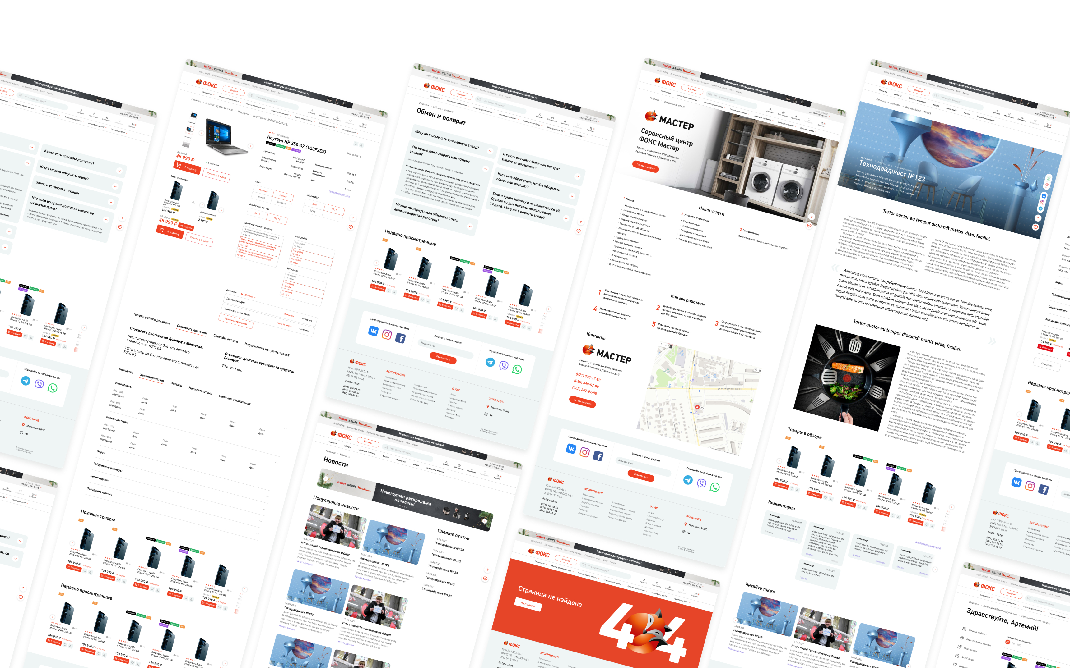
The product pages were rebuilt to provide a clearer hierarchy of information and simplify decision-making. Technical specifications, product variations, availability, feedback sections, and rich content blocks were organized into a more structured and accessible layout.
The checkout flow was also redesigned into a step-by-step process that gives users better control and transparency during order completion.
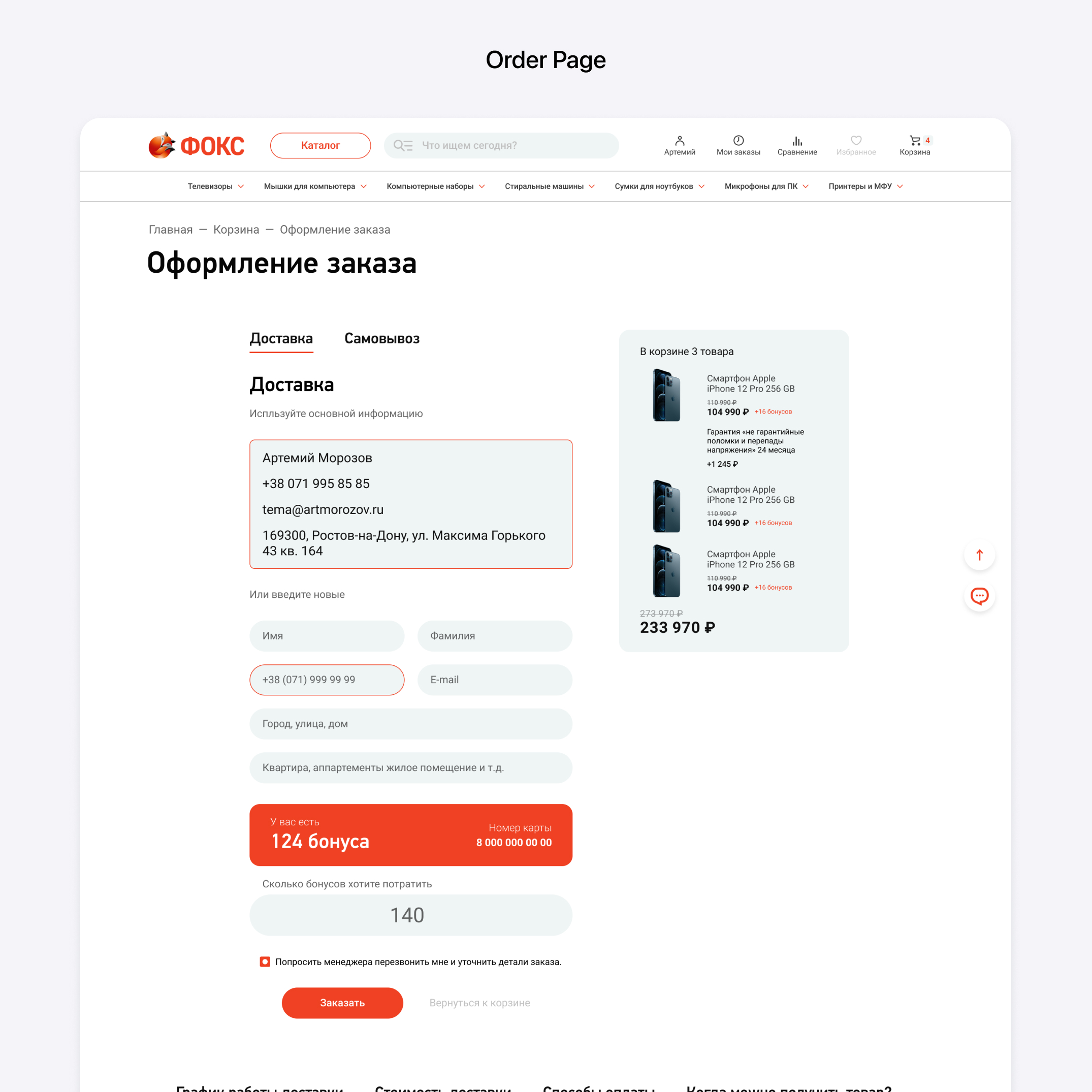
The personal account section received a complete redesign and evolved into a fully functional dashboard. Users can now monitor active orders, purchase history, loyalty program points, saved products, viewed items, and personalized offers within a single ecosystem.
Additional account sections were introduced to improve order management and increase engagement with loyalty features.
Security and accessibility were also important parts of the redesign. The authorization system was updated with a more intuitive authentication flow and two-factor verification to improve account protection and user trust.
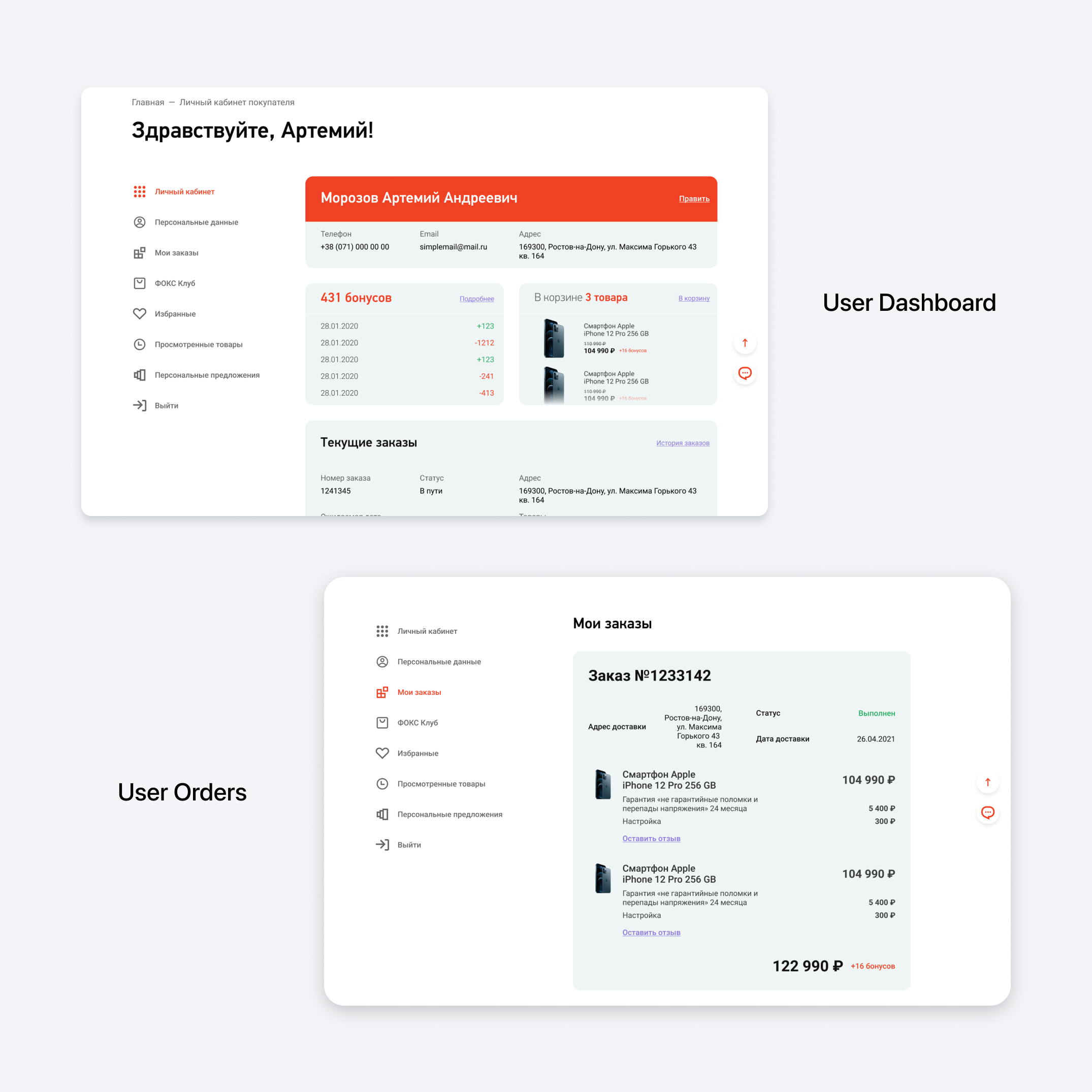
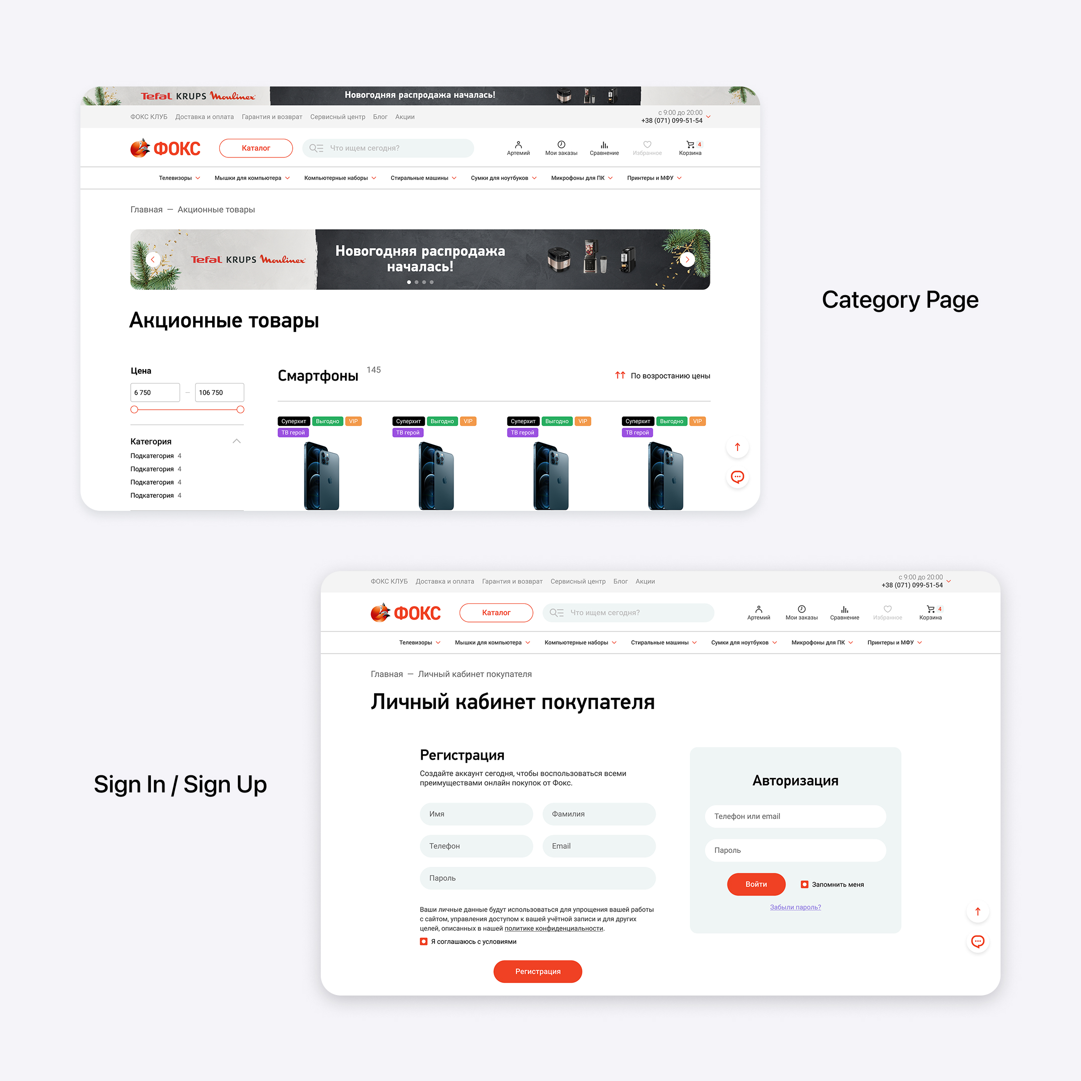
Alongside the shopping experience, an informational ecosystem was created for editorial content, product reviews, company news, service information, guarantees, delivery details, and promotional campaigns. The complete design system includes more than 100 unique frames and screens.
Advertising integration became another important part of the platform. Native promotional blocks and vendor advertising placements were carefully embedded into the interface without disrupting the shopping experience. Additional guidelines were created for partners and vendors to ensure visual consistency across campaigns.
The mobile version was designed with the goal of preserving the full functionality of the desktop experience while adapting it to faster and more intuitive mobile interactions. A new navigation system was introduced, combining a bottom navigation bar with a side menu structure.
The bottom navigation provides quick access to the catalog, search, shopping cart, and personal account, while contextual actions and CTAs dynamically appear depending on the current page. The side menu contains additional navigation layers, duplicated quick actions, and informational pages, creating a seamless experience across the entire platform.
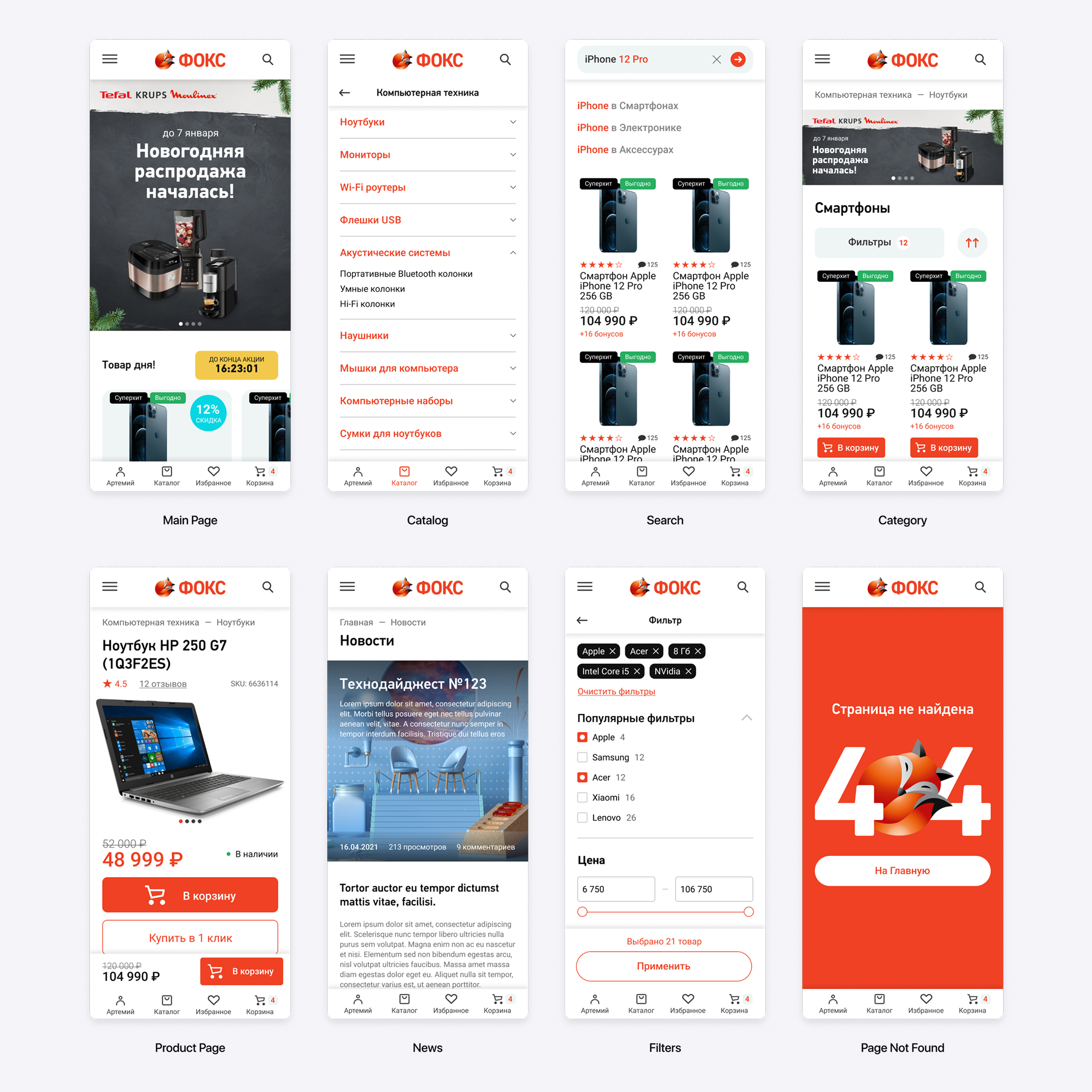
A scalable and conversion-focused e-commerce ecosystem with an improved shopping experience, optimized navigation, enhanced personalization, and a fully adaptive interface designed for high-volume online retail.